

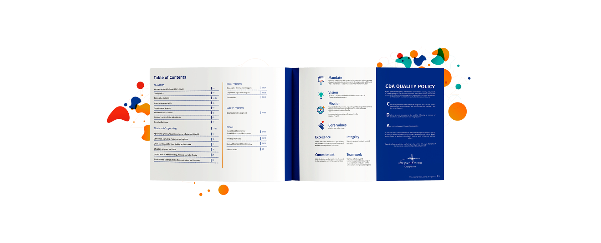
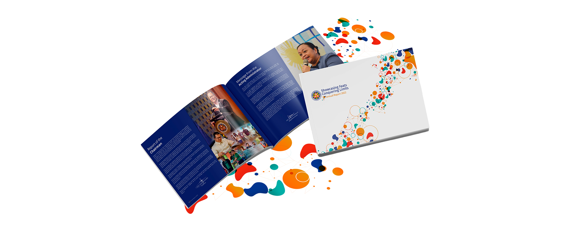
The CDA Annual Report 2022, I designed a professional and visually engaging layout that highlights key achievements and data. Using clean typography, a cohesive color scheme, and clear infographics, I ensured the report is both informative and accessible.
The modern design balances readability with visual appeal, incorporating relevant imagery to underscore CDA’s impact. My goal was to present the annual data in a way that is engaging and easy to navigate, reflecting the authority and professionalism of the CDA.
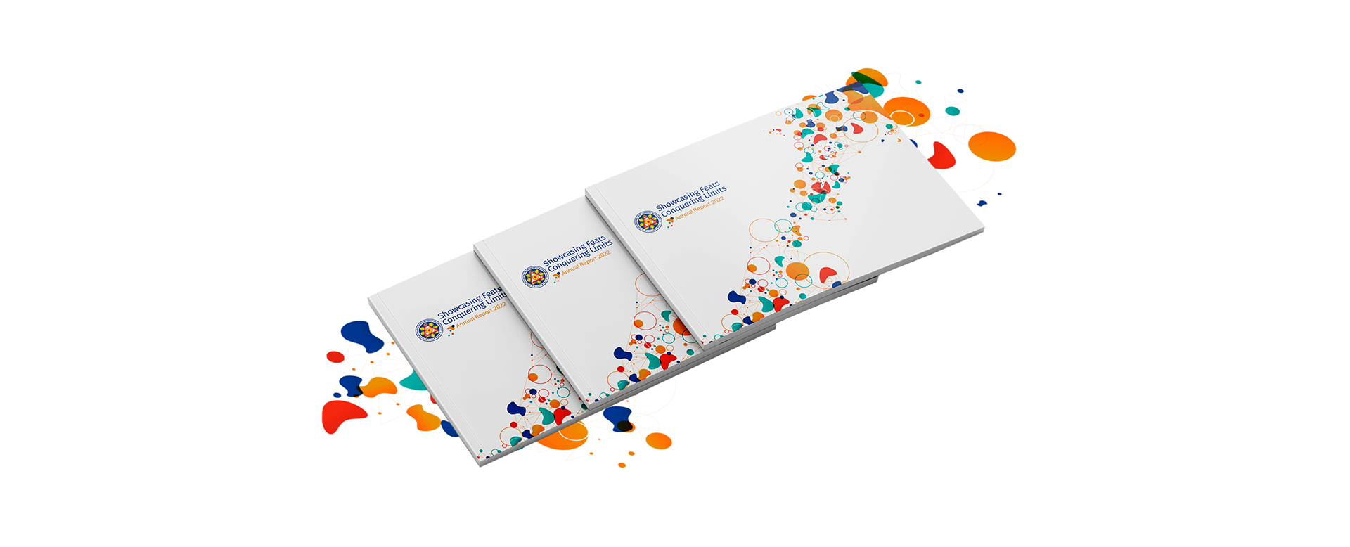
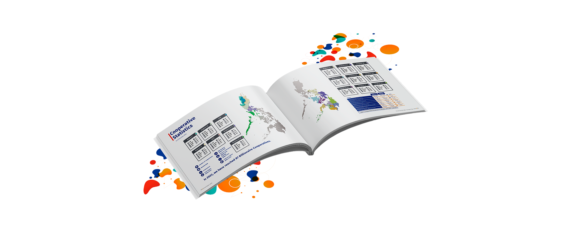
About the Cover
The colored spheres represent the numerous achievements the Authority has accomplished despite the challenges it has faced. The radiant colors surrounding each sphere reflect the Authority's responsiveness in overcoming the complexities of forging partnerships and collaborations, which have significantly impacted the lives of cooperative members and their communities.
Teal represents open communication and clarity of thought.
Red orange represents passion and engagement.
Blue represents trust, loyalty, sincerity, and wisdom.
Each of these colors reflects a value that the Cooperative Development Authority holds.

Access the Full Annual Report Here